

Color has the power to transform a space effortlessly; but why not consider diving into the world of bold colors for a more dramatic impact? Imagine a room where electric blue walls create a vibrant atmosphere or sunburnt orange accents add a dynamic feel. These daring hues can make your spaces not only visually appealing but also emotionally invigorating.
Incorporating bold colors in your decor began as a trend in the 1960s and has evolved significantly since then. Today, it is backed by research indicating that certain colors can positively influence your mood and even boost productivity. For instance, a recent survey found that people working in colorful environments are up to 15% more productive than those in monochromatic spaces. This data underlines the practical benefits of embracing bold colors in your interior design.
- Choose a dominant bold color that reflects your style and complements the space.
- Incorporate accent colors using pillows, rugs, and artwork for balance.
- Use color contrast thoughtfully; pair bold colors with neutral backgrounds to avoid overwhelming the room.
- Consider lighting as it affects how colors appear in different settings.
- Test small areas first to ensure the bold hues achieve the desired effect.
The Power of Bold Colors in Interior Design
Bold colors can transform a space instantly, creating a dramatic and memorable impact. Bright hues like red, blue, and yellow demand attention and convey energy. They can set the mood and tone of a room, making it feel lively and inviting.
Using bold colors in interior design isn’t just about making a space look good. It can also influence how you feel. For instance, a room painted in rich, bold colors can boost your creativity and energy levels.
Another advantage of bold colors is their versatility. They can work well in any room, from the living room to the kitchen. Bold colors can complement both modern and traditional decor styles, offering flexibility in design choices.
Finally, incorporating bold colors can make a small space appear larger. Bright, bold colors reflect light better, creating an illusion of a more expansive area. This makes bold colors a wise choice for small apartments or rooms.
Discovering Your Ideal Palette
Choosing the perfect color palette for your home can feel overwhelming. However, finding your ideal hues is not as hard as you might think. It’s all about understanding what colors resonate with your personality and style.
Firstly, consider what mood you want to create in different spaces. Warm colors like red and orange can evoke energy and passion, while cool colors like blue and green promote calm and relaxation. Knowing the desired mood can guide your color choices.
Next, explore various color schemes to see what catches your eye. Some people prefer monochromatic schemes, using different shades of the same color. Others might like complementary colors, which are opposite each other on the color wheel.
Lastly, don’t be afraid to experiment! Use color swatches or paint samples to see how colors look in your space. Lighting can also impact how colors appear, so consider testing them in natural and artificial light. This hands-on approach can help you finalize your palette with confidence.
Exploring Warm and Cool Colors
Warm colors include red, yellow, and orange. These colors are often associated with sunlight and warmth. They can make a room feel cozy and inviting.
Cool colors, on the other hand, include blue, green, and purple. These hues are reminiscent of water and sky. Cool colors can make a space feel calm and serene.
Whether you prefer warm or cool colors, the key is to choose what makes you feel comfortable. Your ideal palette should reflect your personal taste and the atmosphere you want to create.
Understanding Color Schemes
Monochromatic color schemes use various shades of one color. This can create a harmonious and elegant look. For example, using different shades of blue can give a room a cohesive feel.
Analogous color schemes use colors that are next to each other on the color wheel. These combinations often mimic colors found in nature. An example would be combining yellow, green, and blue for a natural, soothing palette.
Complementary color schemes use colors that are opposite each other on the color wheel. This can create a bold and vibrant look. Think of pairing blue with orange or purple with yellow.
Testing Your Palette
Before committing to a palette, it’s a good idea to test the colors in your space. Paint small sections of your walls or use large color swatches. This will help you see how the colors look in different lights.
Testing your colors during various times of the day is crucial. Natural light can make colors appear differently than artificial light. For instance, a shade that looks great during the day might look different in the evening.
If you’re still unsure, consider getting expert advice. Many paint stores offer color consultations. Professional guidance can help refine your choices and ensure you create a cohesive and appealing palette.
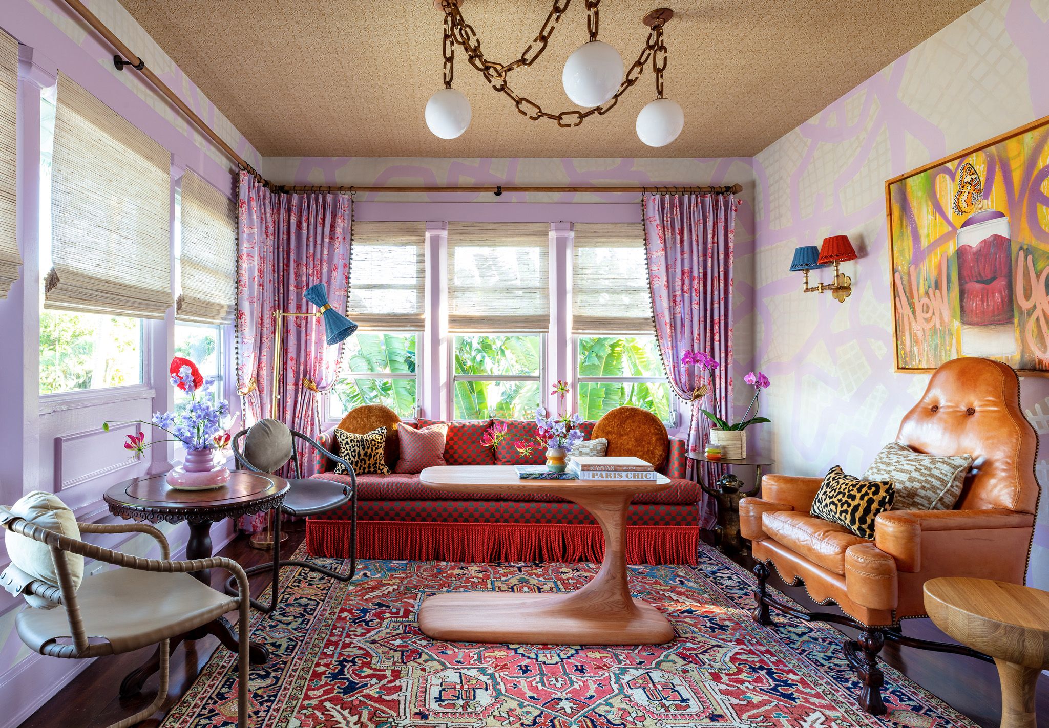
Tips for Combining Bold Colors
Combining bold colors can be exciting and challenging. Start by choosing a dominant color and then select one or two accent colors to complement it. This creates a balanced and harmonious look.
Use the 60-30-10 rule to guide your color distribution. This rule suggests that 60% of the room should be the dominant color, 30% a secondary color, and 10% an accent color. This approach ensures consistency and visual appeal.
Another tip is to keep the color wheel in mind. Complementary colors, which are opposite each other on the color wheel, can create vibrant and dynamic contrasts. Analogous colors, which sit next to each other on the wheel, offer a more harmonious and serene look.
Lastly, don’t forget about textures and patterns. Incorporate different materials and designs to add depth and interest to your space. Textured walls, patterned rugs, and colorful cushions can make your bold color choices stand out even more.
Creating Statement Walls with Bold Colors
Creating a statement wall with bold colors is an exciting way to transform a room. Start by selecting a wall that you want to highlight. This could be the wall behind the bed, the sofa, or even the dining area.
Next, pick a bold color that contrasts with the other walls in the room. Deep blues, rich reds, or vibrant greens can add instant drama. This focal point can set the tone for the entire space.
Don’t hesitate to use patterns and textures along with bold colors. Wallpaper with bold prints or textured paints can make the statement wall even more striking. This adds both visual interest and depth.
When decorating the rest of the room, ensure other elements complement your statement wall. Choose furniture and accessories in neutral tones or subtle patterns. This draws attention to the bold wall without creating visual chaos.
Lighting is also crucial for a statement wall. Use accent lights to highlight the bold colors and textures. Spotlights, floor lamps, or even string lights can enhance the wall’s visual appeal.
Finally, don’t forget to accessorize. Art pieces, mirrors, or shelves on the statement wall can add personality and functionality. These elements can make your bold statement wall both beautiful and practical.
Using Bold Colors for Accents
Bold colors don’t have to dominate a room to make an impact. Small accents can bring vibrant energy to any space. Think about throw pillows, rugs, or vases in striking hues.
Using bold colors in accents allows for flexibility. You can easily switch out items according to season or mood. This makes it a budget-friendly way to refresh your decor.
Consider painting a small piece of furniture in a bold color. This could be a side table, bookshelf, or even a chair. A bold piece can stand out and become a focal point in a neutral room.
Don’t underestimate the power of art. Bold-hued artwork can transform a bland wall into a captivating feature. Choose pieces with vivid colors that resonate with your style.
Bold curtains or blinds are another excellent way to introduce color without overwhelming the room. Paired with neutral walls, they draw just enough attention to make a statement. This approach adds vibrancy while maintaining a balanced look.
Bold Colors in Furniture Selection
Using bold colors in furniture can dramatically enhance a room’s character. A brightly colored sofa or chair can become a statement piece. This sets the tone for the entire space.
Mixing bold furniture with neutral surroundings creates a balanced look. Neutral walls and floors can make bold furniture pop. This approach keeps the room visually appealing and not overwhelming.
Consider using bold colors for smaller furniture pieces too. A vivid coffee table or a bright side table can add flair without taking over. These smaller pieces offer versatility and easy updates.
Another idea is to match or contrast your bold furniture with accent pieces. Use matching cushions or throws to create harmony. Alternatively, contrasting small items can add layers of interest.
Remember to think about material and texture. A bold-colored velvet sofa can add luxury, while a brightly painted wooden chair can add rustic charm. The combination of color and texture makes the furniture piece even more captivating.
Finally, be strategic with your placement. Position your bold furniture in spots that draw the eye upon entering the room. This creates an immediate focal point, making the space memorable and inviting.
Embracing Patterns and Prints in Bold Hues
Incorporating patterns and prints in bold hues can instantly energize a space. Striking geometric designs or vibrant floral prints add layers of personality. These elements can make any room feel more dynamic and visually stimulating.
Begin by choosing a key pattern that features your favorite bold colors. This could be a rug, wallpaper, or even curtains. This pattern will act as the focal point, grounding the rest of your decor choices.
Complement your primary patterned piece with smaller items. Throw pillows, art pieces, and blankets can all feature subtle variations of the same bold hues. This creates cohesion without overwhelming the senses.
If you’re hesitant to use too many bold patterns at once, balance them with neutrals. White or grey walls can soften the impact of bold designs. This ensures that the patterns pop without clashing or feeling too chaotic.
Don’t forget to mix different types of patterns for added interest. Combining stripes with florals or polka dots with abstract shapes creates depth. The fusion of patterns keeps the eye engaged and adds sophistication to your decor.
Finally, test out sample swatches before making final decisions. Seeing how various patterns look together in your actual space helps avoid design regrets later on.
Maintaining Flow with Bold Colors across Rooms
Keeping a cohesive flow with bold colors across different rooms can be tricky but rewarding. Start by choosing a main color theme that you love. This will serve as your anchor for the entire home.
Make sure to carry this color through each room in subtle ways. For example, if your main color is deep blue, use it for living room pillows, kitchen dishes, and bathroom towels. These small touches help tie all the spaces together.
Transition colors can also help maintain flow. Choose a couple of secondary colors that complement your main color. Use these to blend rooms together while keeping the bold theme consistent. This approach creates a seamless visual journey.
Consider an open floor plan if possible. Open layouts allow bold colors to spill naturally from one space to another. This eliminates harsh breaks between rooms and offers more design freedom.
Avoid overwhelming any single room with too much bold color. Balance is key. Combine bold hues with neutrals like white, beige, or gray to maintain an elegant look.
Lastly, don’t be afraid to experiment with patterned rugs or frames to harmonize the rooms. These accents can incorporate your main and secondary colors effortlessly, adding flair and unity to your home.
Frequently Asked Questions
Bold colors can add vibrant energy and personality to any space. Below are some common questions and answers about decorating with bold colors.
1. How do I choose the right bold color for my home?
Selecting the right bold color begins with understanding your personal style and the mood you want to create. Check how colors make you feel and whether they energize or calm you. This will help guide your decision.
Next, consider how various lighting conditions may affect the appearance of different hues in your space. Testing paint samples on your walls under both natural and artificial light ensures you’re making an informed choice.
2. Can bold colors work in small spaces?
Absolutely! Bold colors can actually make small spaces feel more vibrant and expansive. Using bright, rich hues on one wall or throughout can create a striking impact that enlarges the room visually.
Complement these colors with lighter or neutral furniture to maintain balance and prevent overstimulation. Creating this contrast helps in giving a spacious look even if the area is compact.
3. What are some good ways to incorporate bold patterns into decor?
You can start by introducing patterned items like throw pillows, rugs, or curtains featuring bold motifs. This allows you to experiment without committing fully to a dominant pattern on walls or large furniture pieces.
If you’re feeling adventurous, try wallpaper with bold prints for an accent wall or combine different patterns within the same color scheme for varied textures without cluttering up the visual landscape of your room.
4. How do I ensure that my room doesn’t feel overwhelming with multiple bold colors?
The key is balancing bold colors with neutral shades such as white, gray, or beige to soften their intensity. Use the 60-30-10 rule—60% dominant color, 30% secondary color, and 10% accent color—to distribute hues evenly across the space.
This method helps achieve a cohesive look while allowing each color its moment to shine without overwhelming others. Add accessories gradually so that adjustments can be made easily as needed.
5. Are there any rules for mixing bold hues in a single room?
A good practice when mixing multiple bold hues is using complementary or analogous colors on the color wheel for harmony and balance. Complementary colors create vibrancy by contrasting; analogous provide unity through similarity.
Bold backdrops should blend well with similar intensity levels so neither tone overpowers another too much—this harmony enhances aesthetic appeal effectively while maintaining balance throughout interior decor choices made consciously at every turn!
Conclusion
Decorating with bold colors offers endless opportunities for creativity and expression. By understanding how to select and balance these dynamic hues, you can transform any space into a vibrant masterpiece. Remember, the key is to reflect your personality and create the desired atmosphere.
Whether you are creating statement walls, using bold accents, or blending patterns and prints, bold colors can add life and energy to your home. So go ahead, make bold choices, and enjoy the exciting journey of interior design with bold colors. Your home will thank you for the burst of personality and style.