

Imagine walking into a room where geometric shapes dance harmoniously with floral prints. This visual symphony doesn’t happen by chance—it’s a meticulously planned feat of design. Mixing patterns in interior design can transform a space from drab to dynamic, but it requires a balanced approach.
The history of mixing patterns in interior design dates back to the Renaissance, where vibrant tapestries and richly patterned rugs added complexity to simple interiors. Fast forward to today, and 73% of interior designers believe that thoughtfully mixed patterns can elevate a room’s aesthetic. The key lies in blending scales, maintaining a cohesive color palette, and understanding the space’s overall flow and function.
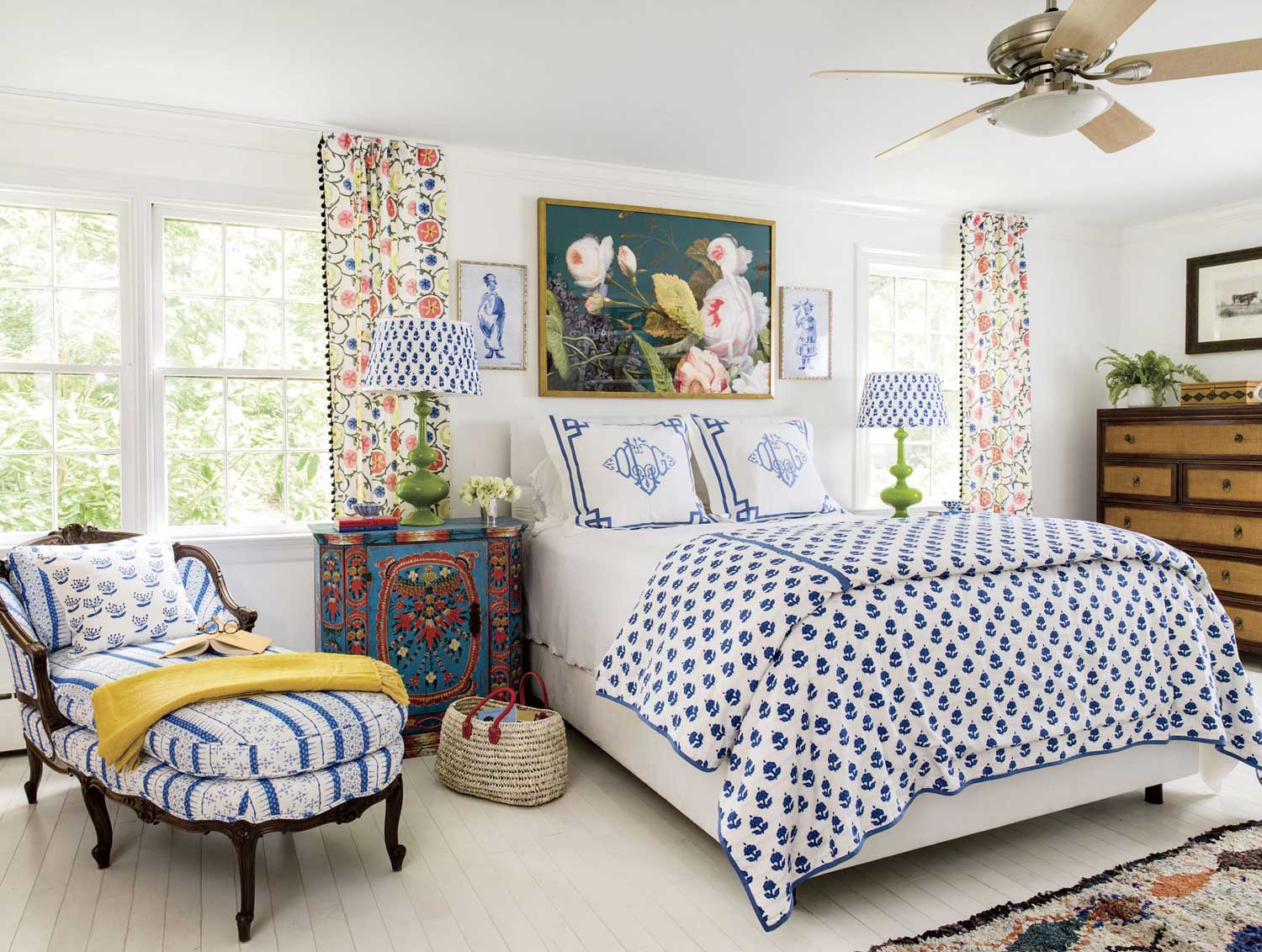
- Select a base pattern you love to set the tone.
- Choose secondary patterns that complement the base in scale and color.
- Balance bold patterns with neutral tones to avoid visual clutter.
- Incorporate different textures for added depth and interest.
- Stick to a cohesive color palette for harmony.
- Experiment until you achieve a dynamic yet balanced look.
The Journey Through History: Pattern Mix in Interior Design
From ancient tapestries to modern wallpapers, the art of mixing patterns has a rich history. In the Renaissance, wealthy homes showcased intricate patterns in their décor. This set the stage for future design trends.
During the Victorian era, pattern use exploded. Bold floral patterns and complex geometric designs were often layered in a single room. This created vibrant and energetic spaces.
The 20th century brought a shift toward moderation. Designers started combining patterns more subtly, focusing on balance and harmony. This approach still influences modern interior design.
Today, mixing patterns is an essential part of creating stylish and inviting spaces. Whether using stripes, florals, or prints, the key is to maintain a cohesive look. This requires a thoughtful blend of colors and textures.
The Basics of Mixing Patterns in Design
Mixing patterns in design can bring life and interest to any room. The key is to follow a few simple rules. Balance is crucial, using too many patterns can overwhelm a space.
Choosing the Right Patterns
Start by selecting your base pattern. This will guide the rest of your design choices. Geometric patterns are often easier to mix with other designs.
Next, pick secondary patterns to complement the base. Patterns with different scales can create a balanced look. For example, pair large florals with small polka dots.
Finally, maintain a cohesive color palette. Stick to 2-3 main colors. Coordination will help keep the design harmonious.
Balancing Different Scales
Using patterns of various scales is effective. Large patterns should dominate, while smaller ones add detail. This approach prevents the room from looking cluttered.
Patterns of similar scale compete for attention. To avoid this, balance bold designs with more subtle ones. Neutral colors can help to tone things down.
Also, consider the size of the space. In a small room, use fewer large patterns. In a larger space, you can afford to be more adventurous.
Incorporating Texture
Texture adds another layer of interest. It can enhance the effect of mixed patterns. For example, a soft velvet can complement a vibrant print.
Consider using textured items like cushions or rugs. These not only add depth but also comfort. Texture balances the visual and tactile experience.
Don’t forget about the walls. Textured wallpaper can blend seamlessly with other patterns. This creates a cohesive and inviting space.
Getting Started: Choosing Your Base Pattern
Choosing a base pattern is the first step in transforming your space. This foundational element will influence the overall design. Start with something you love and build from there.
Your base pattern can be anything from floral prints to geometric shapes. Consider the mood you want to create. For a calming effect, choose softer, more muted tones.
If you’re aiming for a vibrant look, bold patterns work best. They set the stage for more adventurous elements. Remember, the base pattern grounds the entire design.
Once you’ve decided on a base, think about coordinating secondary patterns. These should complement but not overshadow the primary design. Balance is key to achieving a cohesive look.
Adding Layers: Introducing Secondary Patterns
Once you have your base pattern, it’s time to add secondary patterns. These enhance the overall visual appeal. Secondary patterns should complement your base without overwhelming it.
Consider the scale of your patterns. Large base patterns pair well with smaller secondary designs. This balance maintains a unified look.
Mixing different types of patterns can add depth. For example, combine stripes with florals or geometric shapes with organic prints. Variety keeps the design engaging and dynamic.
Consistency in color can help tie your patterns together. Stick to a cohesive color palette. This approach creates harmony throughout the space.
Feel free to experiment. Secondary patterns offer a chance to get creative. Play with different textures to add even more layers of interest.
Don’t overcrowd the room. Use patterns thoughtfully and sparingly. This ensures your space feels inviting, not chaotic.
Crafting Depth: Incorporating Texture into Pattern Mix
Texture adds a whole new dimension to pattern mixing. It enhances the complexity of the design. Combining textures with patterns creates a rich, layered look.
Think about using fabrics like velvet and linen. These materials offer unique tactile experiences. Velvet provides luxury, while linen brings softness.
Don’t forget about textured wallpapers. They can add depth without overwhelming other patterns. Textured walls become a subtle yet impactful backdrop.
Consider using textured accessories. Items like cushions, rugs, and throws add another layer. This approach makes the space feel cozy and inviting.
- Velvet cushions
- Woven rugs
- Linen throws
Mixing metals can also introduce texture. Use items like brass lamps or iron fixtures. Metal adds a unique shine to your design.
Finally, use texture to highlight specific areas. For example, a textured headboard can become a focal point. This draws attention and adds interest to any room.
Color Coordination: The Secret Ingredient of Pattern Mix
Color coordination is key when mixing patterns. It helps bring different designs together. A cohesive color palette can make or break your space.
Start by choosing a main color. This will be the anchor for your patterns. Stick to 2-3 complementary colors for a unified look.
Use various shades of the chosen colors. This adds depth without introducing new hues. Monochromatic schemes can be very effective.
You can also play with color intensity. Mix bold colors with pastels for a balanced approach. This creates a dynamic yet harmonious feel.
Consider the mood you want to set. Warm colors like red and yellow create a cozy atmosphere. Cool colors like blue and green make a room feel serene.
- Warm colors: Red, Yellow, Orange
- Cool colors: Blue, Green, Purple
- Neutral colors: Gray, White, Beige
Finally, add neutral tones to balance vibrant patterns. Neutrals act as a backdrop, letting your patterns shine. They ensure your space doesn’t become too overwhelming.
Striking Balance: Navigating Through Pattern Saturation
Finding the right balance with patterns is crucial. Too many can be overwhelming, while too few may seem boring. The key is moderation.
Select a few dominant patterns and complement them with subtle ones. This mix keeps your space lively without overdoing it. Pairing bold patterns with simpler designs works wonders.
| Pattern Type | Usage |
|---|---|
| Bold Stripes | Feature Wall or Large Furniture |
| Small Florals | Pillows or Accents |
| Geometric Shapes | Curtains or Rugs |
Avoid clustering too many busy patterns in one area. Spread them out to maintain balance. This distribution keeps the room from feeling cluttered.
Neutral spaces provide breathing room for patterns. Use solids to separate complex designs. They act as buffers, ensuring each pattern gets its due attention.
Experimenting is part of the fun. Try different combinations until you find what works best. Your space should feel both cohesive and engaging.
Creative Combos: Uncommon Pattern Mixes That Work
Mixing uncommon patterns can create a stunning visual effect. Dare to combine stripes and florals for a fresh look. This unexpected pairing adds instant intrigue.
Animal prints and geometric shapes offer another exciting mix. These patterns provide a bold, edgy vibe. Use them in small doses to avoid overwhelming the room.
- Striped curtains with floral pillows
- Leopard print rug with geometric artwork
- Checkerboard floor with botanical wallpaper
Don’t shy away from cultural patterns. Ikat and paisley, for example, can work beautifully together. They bring a global, eclectic feel to your space.
Playing with scale is vital when mixing unusual patterns. Large-scale designs should pair with smaller motifs. This approach ensures balance and prevents visual chaos.
Finally, trust your instincts. If a combo feels right, go for it! The goal is to create a space that feels unique and personal.
Frequently Asked Questions
Mixing patterns in interior design can be tricky but rewarding. Here are answers to some common questions that can help you navigate this creative process.
1. What is the best way to start mixing patterns?
Begin by choosing a strong base pattern that sets the tone for your room. This could be something bold, like a geometric print, or more subtle, like a floral design.
Once you have your base, add complementary patterns in varying scales and colors. Remember, balance is key; your chosen patterns should harmonize rather than clash.
2. How do I ensure my pattern mix doesn’t feel overwhelming?
Avoid overcrowding your space with too many patterns. Instead, start with one main pattern and build from there using smaller or more subdued designs.
You can also use neutral tones to break up busy areas and create visual relief. This helps maintain a calm yet engaging atmosphere.
3. Can texture play a role in mixing patterns?
Yes, incorporating textures adds another layer of depth to your design. Textured materials like velvet or linen can complement your chosen patterns beautifully.
You can use textured wallpapers or fabrics to create focal points within the room. Combining different textures will contribute to a well-rounded and cohesive look.
4. Are there any color rules when mixing patterns?
Select a consistent color palette of 2-3 shades to tie your patterns together cohesively. Using various shades of these colors ensures harmony in your design.
A monochromatic scheme often works well because it keeps the focus on the exciting mix of patterns rather than clashing colors.
5. What types of patterns work well together?
You can successfully mix natural motifs with geometric shapes for an eclectic look that feels balanced and interesting. Consider combining stripes with florals for contrast.
Cultural designs like ikat or paisley paired with modern prints also offer unique combinations that stand out while maintaining visual harmony.
Final Thoughts on Mixing Patterns in Interior Design
Mixing patterns in interior design is an art that requires balance, creativity, and a keen eye for detail. It’s about finding the right elements that work together harmoniously. Don’t be afraid to experiment and trust your instincts.
Remember, the goal is to create a space that reflects your personality while feeling cohesive and inviting. By following simple guidelines, you can transform any room into a visually engaging masterpiece. Enjoy the process and watch your space come to life with character and style.