

Imagine transforming a space with the mere whisper of color. Pastels, often underestimated, can lend an air of sophistication and tranquility to any interior design project. For experts who seek to balance vibrancy with subtlety, pastels are a timeless choice.
The use of pastels in interior design dates back centuries, often associated with the elegance of Rococo-style rooms. Studies show that pastel shades can significantly affect mood, creating serene and inviting environments. By integrating pastel hues into walls, furnishings, or even decorative accents, designers can craft spaces that feel both contemporary and refreshingly classic.
- Start by selecting a pastel color palette that complements your existing decor.
- Apply pastels to walls and ceilings using soft, matte finishes for a serene look.
- Incorporate pastel furnishings like sofas and chairs to add focal points.
- Use pastel decor items such as cushions, rugs, and curtains to enhance the overall aesthetic.
- Mix and match different pastel tones to create depth and interest in the space.
- Add textures through fabrics like velvet or linen to make the pastels stand out.
The Power of Pastels in Interior Design
Pastels have a unique ability to transform a room. They can make a space feel light, airy, and welcoming. By using pastels, you can evoke a sense of calm and tranquility.
One powerful aspect of pastels is their versatility. Whether you’re designing a cozy bedroom or a sophisticated living room, they fit in perfectly. These colors easily blend with other design elements.
Pastes can also create an illusion of more space. Light colors reflect more light, making rooms appear larger and more open. This is especially useful in smaller areas where space is limited.
Moreover, pastels work well with various textures and patterns. From soft fabrics to intricate wallpapers, they complement different materials. This flexibility allows for creative and dynamic designs.
The History of Pastels in Interior Design
Pastels have a rich history in interior design, dating back to the 18th century. These muted colors became popular during the Rococo period. They were seen in the elegant designs of French aristocracy.
The Rococo Influence
During the Rococo period, pastel colors were used to decorate grand palaces and mansions. These colors, like soft pinks and blues, were used on walls and ceilings. They gave rooms a light and airy feel.
Furniture also followed this trend, with intricate details and pastel finishes. This style aimed to create a sense of luxury and comfort. Rococo designs continue to inspire modern interior designers.
Interestingly, this era saw the rise of pastel art. Famous artists utilized these colors to create delicate and beautiful artworks.
Mid-Century Modern Revival
In the mid-20th century, pastels made a comeback with the rise of Mid-Century Modern design. Designers incorporated pastel hues into sleek and functional furniture pieces. These colors became a staple in modern homes.
Pastel tones softened the stark lines and shapes typical of the era. This created a balanced and inviting atmosphere.
The popularity of this trend shows how pastels can transcend different design eras. They seamlessly blend tradition with modernity.
Pastels in Contemporary Design
Today, pastels are widely used in contemporary interior design. They help create spaces that feel calm, fresh, and inviting. You can find them in everything from minimalist homes to eclectic spaces.
Modern designers use pastels in innovative ways, combining them with bold colors and patterns. This makes for visually interesting and balanced interiors. Pastels remain a timeless choice for creating stylish and comfortable homes.
As trends evolve, pastels continue to adapt, proving their versatility and enduring appeal.
Choosing the Correct Pastel Tones for Your Space
Selecting the right pastel tones starts with understanding your space’s existing elements. The amount of natural light plays a crucial role. Rooms with lots of sunlight can handle cooler pastel shades like lavender or mint.
Consider the room’s function when picking pastel colors. For a bedroom, calming tones like soft blue or peach create a peaceful vibe. In contrast, lively areas like the kitchen benefit from energetic pastels.
Another factor is the size of the space. Lighter pastels make small rooms feel larger, while darker shades can add coziness to expansive areas. Think about how you want the room to feel and choose accordingly.
Mixing pastels with other colors can also make your design more dynamic. Pairing pastels with neutrals like white or beige balances the palette.
- Experiment with different combinations to see what works best.
- Textures and patterns can also enhance pastel tones.
Application: Pastels for Walls and Ceilings
Using pastels on walls can create a serene and inviting atmosphere. Light pastel shades like soft pink or pale blue can make a room feel more spacious. These colors reflect natural light beautifully.
When it comes to ceilings, pastels can be just as effective. A pastel-colored ceiling can add a surprising touch and draw the eyes upward. This makes the room appear taller and more open.
For a cohesive look, consider pairing pastel walls with white trim. This combination keeps the design clean and highlights the pastel tones. It also allows for more flexibility with furniture and décor choices.
Different textures can enhance the effect of pastel colors. For instance, a matte pastel finish gives a subtle and sophisticated look. On the other hand, glossy pastel paint can add a playful, reflective quality.
Patterns are another way to add interest to pastel walls. Consider using stencils or wallpaper with pastel designs for a unique touch. These elements can break the monotony and add depth to the room.
Finally, don’t be afraid to mix pastels with bolder hues. This contrast can create a striking visual effect.
- Try pairing pastel walls with vibrant artwork or furniture.
- This will make the pastels stand out even more.
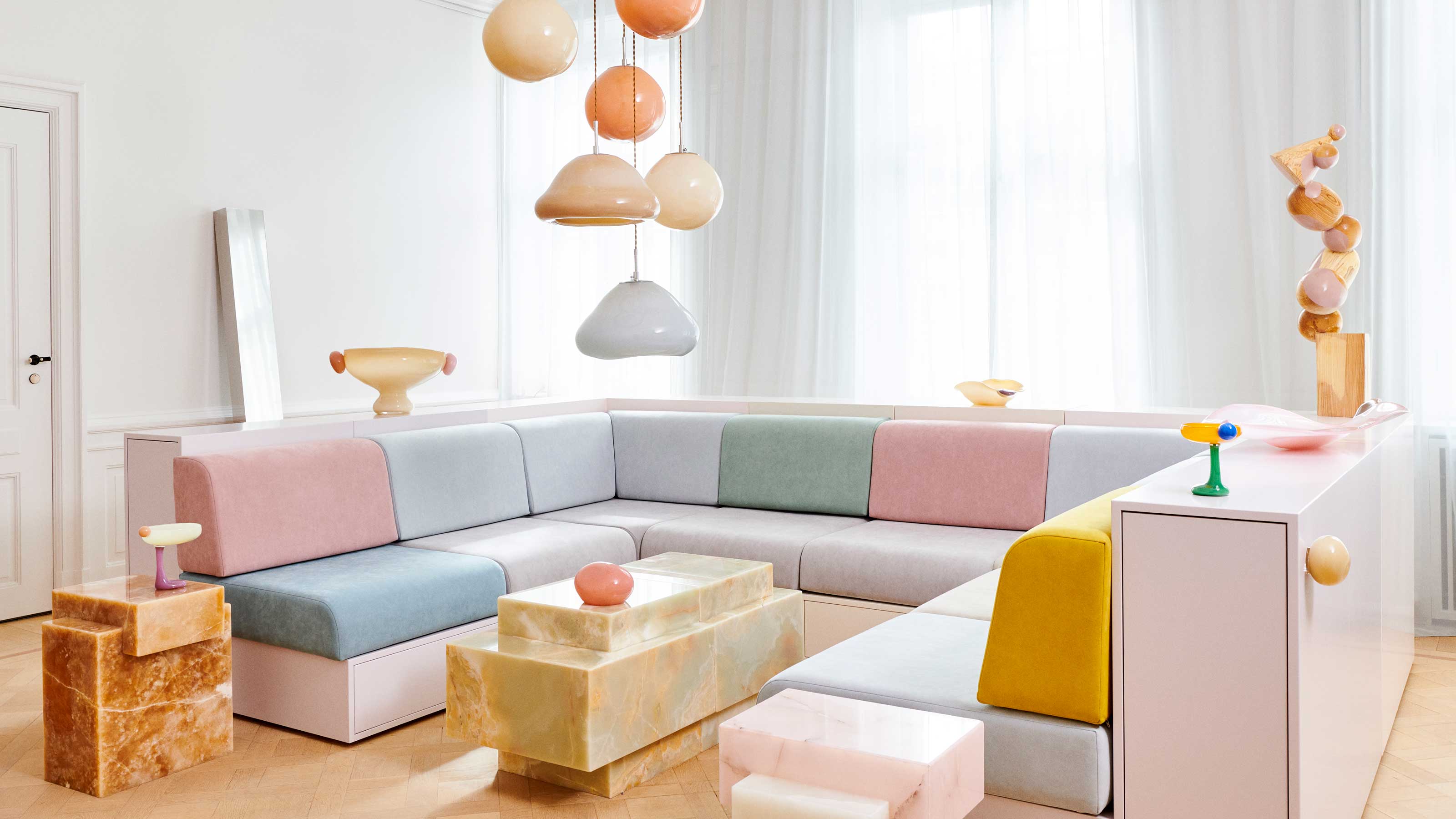
Application: Pastel Furnishings and Décor
Pastel furnishings can bring a fresh and vibrant feel to your space. Consider adding a pastel-colored sofa or armchair to your living room. These pieces can become focal points in the room.
Smaller items like cushions and throws also work well in pastels. They can easily be swapped out to change the room’s look. Table lamps with pastel bases add soft lighting and color.
Using pastel décor items, such as vases or picture frames, adds subtle touches of color. This can create a cohesive and harmonious look. Try grouping these items together for a greater impact.
Wall art in pastel tones is another great way to incorporate these colors. You can choose prints, paintings, or even DIY art projects.
- Make sure to balance pastel art with other elements in the room.
- This keeps the design from feeling too washed out.
Pastel rugs can tie a room together nicely. A soft, pastel-colored rug adds warmth and texture to any space. Plus, it provides a cozy spot for seating or playing.
Don’t forget about pastel curtains or blinds. These can frame windows beautifully while letting in plenty of light. The softness of pastel shades ensures they won’t overpower the room.
Using Pastels to Create Mood and Atmosphere
Pastels have a unique ability to set a particular mood in a room. Soft pastel hues like light blue and lavender can make spaces feel calm and soothing. These colors are often used in bedrooms and bathrooms.
For a cheerful and uplifting atmosphere, pastels like peach and mint green work well. They’re perfect for social areas like the living room or kitchen. These shades can energize the environment without being overpowering.
Pastels also play a role in creating a sophisticated and elegant space. Shades like blush pink and pale gold can add a touch of luxury. When used in dining rooms or home offices, they create an inviting yet professional feel.
Layering different pastel colors can create a visually interesting atmosphere. Combine soft yellows with gentle pinks for a warm, sunny vibe.
- Pairing pastels with neutral tones like gray or white can balance the look.
- This keeps the room feeling fresh and uncluttered.
Pastels work well with various textures to enhance the mood. Velvet in pastel shades can add a plush, cozy feeling. In contrast, pastel-colored linens give a light and airy touch.
Using lighting to enhance pastel colors can also affect the room’s mood. Soft, warm lighting makes pastels look even cozier. Cool lighting can highlight the clarity and freshness of pastel shades.
Mixing and Matching Pastels
When mixing and matching pastels, balance is key. Combining too many different shades can look chaotic. Selecting two or three main pastel colors often works best.
Pairing pastels with white or neutral tones creates harmony. For instance, soft pink can complement a light gray couch. This keeps the space looking fresh and modern.
You can add depth by using varying intensities of the same pastel color. Light blue walls paired with deeper blue pillows create a cohesive look. This method adds interest without overwhelming the room.
- Use complementary colors to make features stand out.
- Pale yellow and lavender can highlight each other beautifully.
Textures play a crucial role in blending pastels seamlessly. A velvet rose-colored chair adds richness against matte mint green walls. Different fabrics add layers to the design.
Dare to experiment with patterns when mixing pastels. Striped pastel curtains can work well with polka-dotted cushions of similar hues. This approach keeps your decor lively and engaging.
Pastel Color Schemes: Case Studies
In a modern apartment, designers used a pastel palette to create a calming oasis. The combination of soft blues and light grays on the walls provided a serene backdrop. Pastel pink accents added warmth and charm.
A cozy café utilized pastel shades to create a welcoming atmosphere. Mint green chairs and lavender tablecloths made the space feel fresh and vibrant. These colors worked together to create an inviting environment.
In a coastal-themed home, pastels played a key role. Sky blue walls and sandy beige furniture gave the space a beachy vibe. The addition of coral and seafoam green accents enhanced the coastal feel.
- Pastel colors can balance each other.
- They create a cohesive and harmonious design.
For a chic nursery, pastel tones were the main attraction. Soft yellow walls combined with blush pink and baby blue accessories created a dreamy space. This mix made the room both stylish and soothing.
Finally, in a minimalistic loft, pastels provided subtle pops of color. Light peach and pale lavender accessories stood out against white walls. This approach kept the design simple yet captivating.
Frequently Asked Questions
Discover answers to common questions about using pastels in interior design. This guide helps you understand the basics and enhance your home’s beauty.
1. What are the best rooms to use pastel colors in?
Pastel colors work wonderfully in bedrooms and living rooms. These spaces often benefit from the calming effect that pastels provide, creating a peaceful atmosphere for relaxation.
Kitchens and bathrooms also go well with pastels due to their refreshing look. They can make these usually smaller spaces feel brighter and more welcoming.
2. How do I balance pastel colors with other bold shades?
Balancing pastel colors with bolder shades involves thoughtful placement and proportion. Try pairing pastel walls with bold furniture or decor items, ensuring that one does not overshadow the other.
You can also use neutrals as a buffer between pastels and bolder shades. This approach maintains harmony while adding visual excitement to your space.
3. Can pastels be used in modern interior design styles?
Yes, pastels can fit seamlessly into modern interior design styles. When combined with clean lines and minimalist decor, they add a touch of softness without overwhelming the sleek aesthetic.
Pastel accents like cushions, rugs, or art pieces can bring warmth to modern spaces. Their subtle hues complement contemporary furnishings beautifully.
4. What are some popular pastel color combinations?
A popular combination is mint green with soft pink; it creates a fresh, lively feel. Another favorite is baby blue paired with peach, offering warmth and tranquility.
Pale lavender matched with soft yellow gives off a cheerful vibe perfect for any room. These combinations show how versatile pastels can be in interior design.
5. Are pastels suitable for small spaces?
Absolutely! Pastel shades can make small spaces appear larger by reflecting light more efficiently than darker tones. They create an open, airy atmosphere that’s welcoming despite limited square footage.
You can maximize this effect by incorporating pastel accessories alongside neutral or white backgrounds to maintain a spacious feel throughout your home.
Conclusion
Incorporating pastels into interior design offers a fresh and inviting approach. These subtle shades can transform spaces, making them feel larger, calmer, and more balanced. Pastels provide versatility for both modern and traditional styles.
By carefully choosing and combining pastel tones, designers can create unique and harmonious atmospheres. Whether used on walls, furnishings, or accents, pastels bring a timeless elegance to any space. Embrace the power of pastels to elevate your design projects.