“`html

Arguably the “biggest” time of year to discuss color is fall. It’s when all the fashion trend reports hit, when paint companies and the like start releasing their Color of the Year, and generally when everyone starts talking about what might be waiting for us when the calendar crosses over. Of course, trends don’t just reset come January 1 (or September 1), but the air is always buzzing with the electricity of newness after Labor Day.
One of the most powerful color trends of the past year was red (whether it was expected or unexpected to you and your home), but there’s something else on the horizon, and I wasn’t totally sold on it…until now.
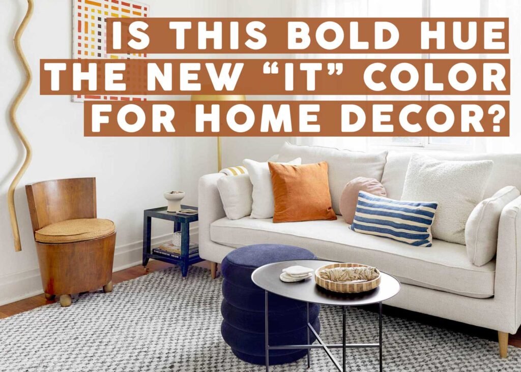
It’s no secret that fashion influences what makes it into our homes, so when I saw a handful of reports coming out (including this one from The Everygirl) stating orange as the color to watch, I had my doubts. Orange is notoriously a tricky color to work with (or wear), unless of course you slide it around the color wheel to have a bit more brown in it (terra cotta) or a bit more red in it (rust or ginger).
But then, as I was working on the stained glass article from last week, I found this hallway from Reath Design that I couldn’t get out of my head. It’s drenched in a rich orange paint, balanced by a creamy, peachy tone on the ceiling, and brought to life with the kaleidoscope of tones on the door’s panels.
Had this room been red, for instance, it might have still been beautiful but it would have been INTENSE depending on the specific shade. But in this earthy orange, it’s welcoming, warm, and vibey. It played nice with the seven other colors showcased in the compact area. It was part of the chorus line, not the protagonist. And I loved it.
Do I…love…orange now? Huh? Was my brain just trying to jump on the early bandwagon before it became too big so I could say “I knew it would be a thing”? Was I just ready for fall, where all things oranges always reign supreme? Was I just reacting to this specific room? I had to dig deeper.
“`

