

Today’s edition of Design SOS highlights common themes among our reader submissions and their home transformations: concise comments and requests, mid-century style, and the need for surface-level tweaks that can greatly enhance the final look. While major overhauls are not on the agenda for this series, simple changes like paint in the bathroom and refining the decor and color palette in every room can lead to significant improvements. Choosing soft goods for your rooms, such as rugs, curtains, and art pieces, can completely transform a space, providing a sense of design direction and completion.
If you’re new here, you can catch up on all our recent Design SOS posts here. Let’s dive into today’s home transformations, starting with the vintage pink bathroom.
Home Transformations: The Vintage Pink Bathroom
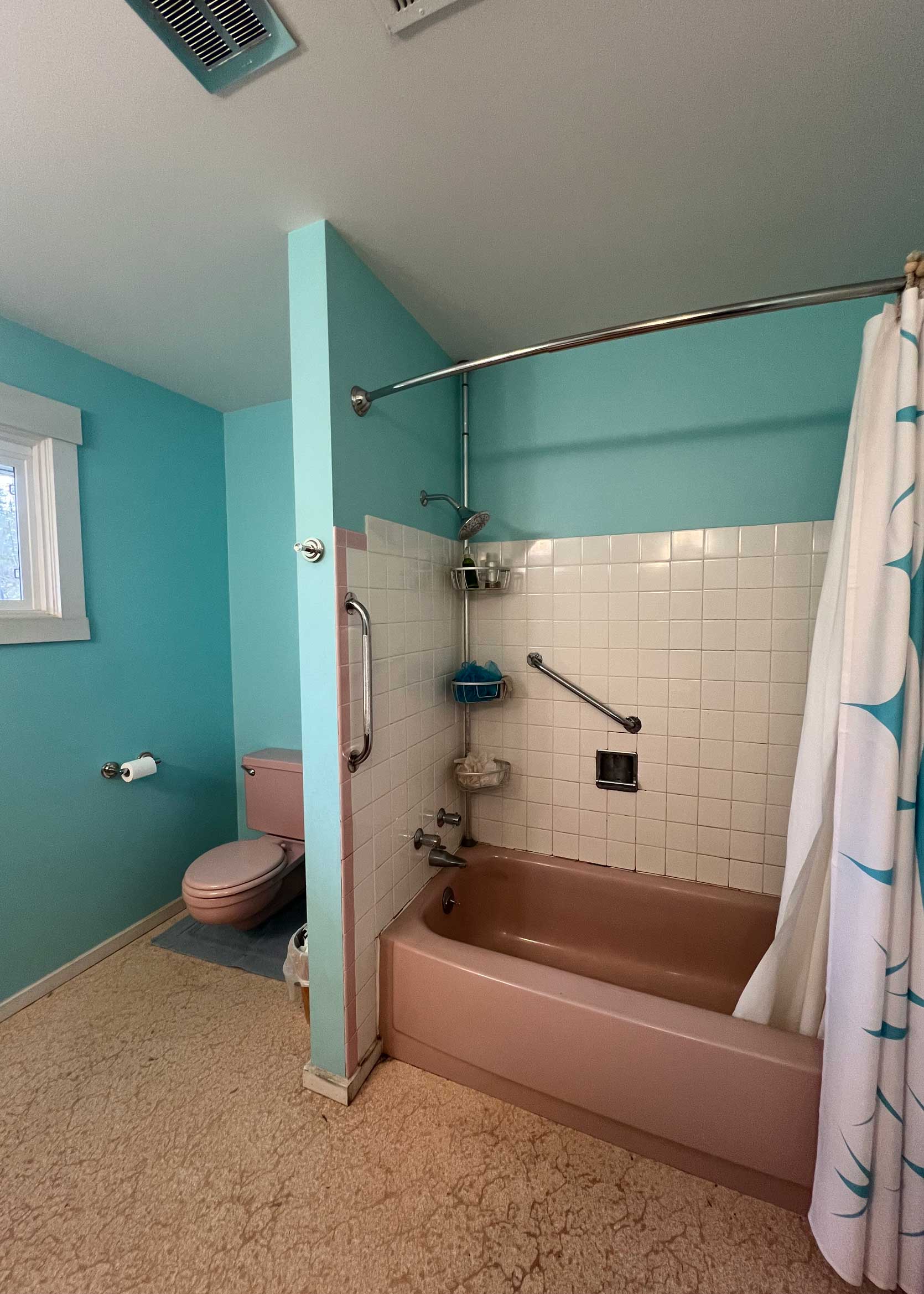
From reader: Hello! I would love to get your suggestions for my mid-century pink bathroom. You’re my favorite insta follow! Thanks!
My quick style swaps: Show me a vintage bathroom with colored fixtures, and I’ll show you my attention! Living in Los Angeles really made me appreciate the hidden beauty of an older bathroom. Where most people would be tempted to just rip it all out, I’m not certain whether this reader is after an intense refresh/reno, or just some ideas for how to like this space some more. Off the bat, I’d immediately change that blue. The shade of that with the floors and the dusty pink fixtures feels like cotton candy. When your color combinations are off, it can make things feel way dingier than they likely are. So let’s fix that. Here’s what I suggest:
- Paint the walls a warmer shade, such as a soft yellow or a blushy pink to just lean all the way in.
- Bring in some texture with rugs, towels and an updated shower curtain.
- Layer in some accessories and art.
- Optional: Do a quick, affordable floor upgrade with some peel-and-stick that suits the age of the bathroom. It’s hard to tell the exact color or material of what is there right now, tbh.
- Optional: Swap out the lighting and mirror.
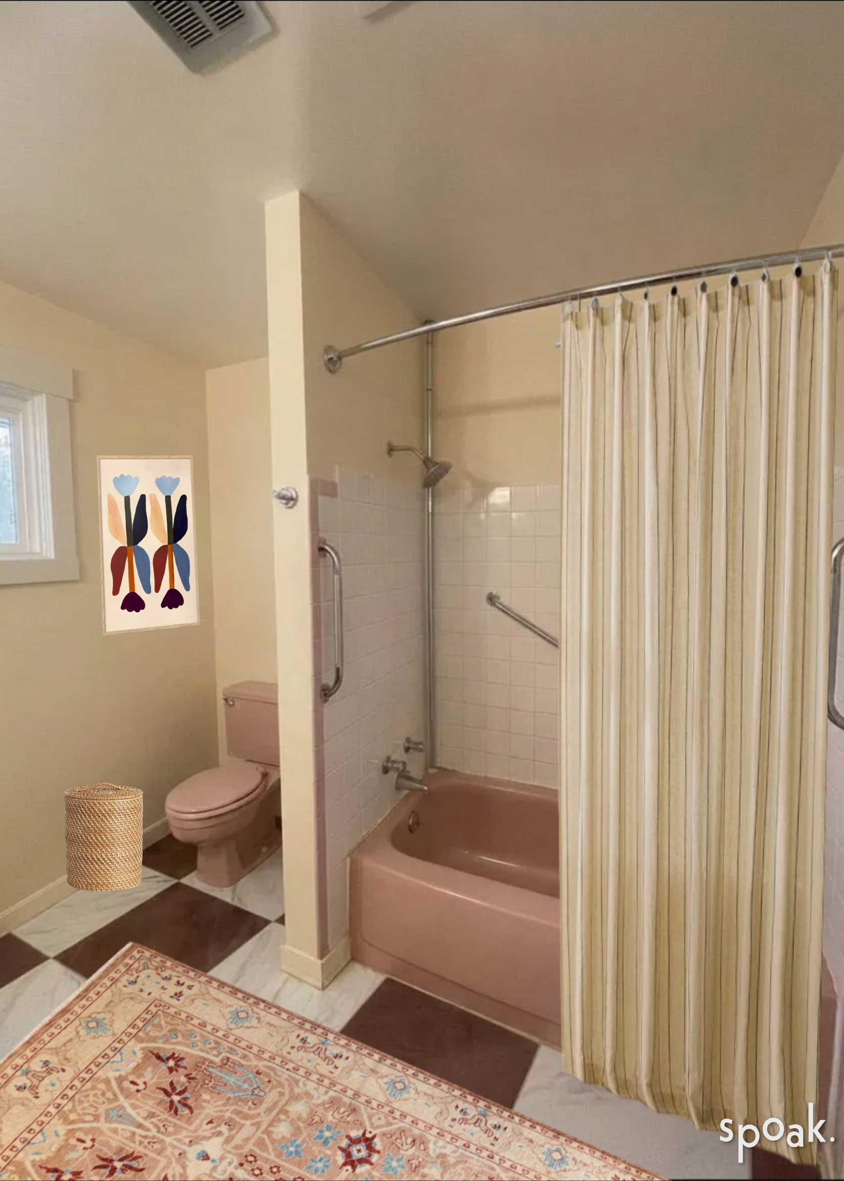
Here it is with some Spoak rendering magic (the program we’ve been using to help us bring these designs to life more realistically). Fair warning: It takes a lot of creative liberties with the products I included as well as the existing features of the room, but I wanted to show you anyway even if half of it is wrong to really drive home the “feel” of it. The paint color is off in the right photo (too orange), but I do love that buttery cream with the pink throughout.