

My husband, who isn’t into design, mentioned the Pantone color of the year recently. This surprised me because his social media feed is usually filled with different content than mine. The fact that Pantone has made its way into his feed indicates that this year, everyone is talking about it, whether positively or negatively.
If you’re unfamiliar with Pantone’s “Color of the Year,” it’s an annual tradition where Pantone, a global authority on color, selects a color that reflects the current culture, events, and design trends. This color often influences various industries, from paints to textiles. The chosen color for the upcoming year is meant to capture the essence of the times and evoke certain emotions.
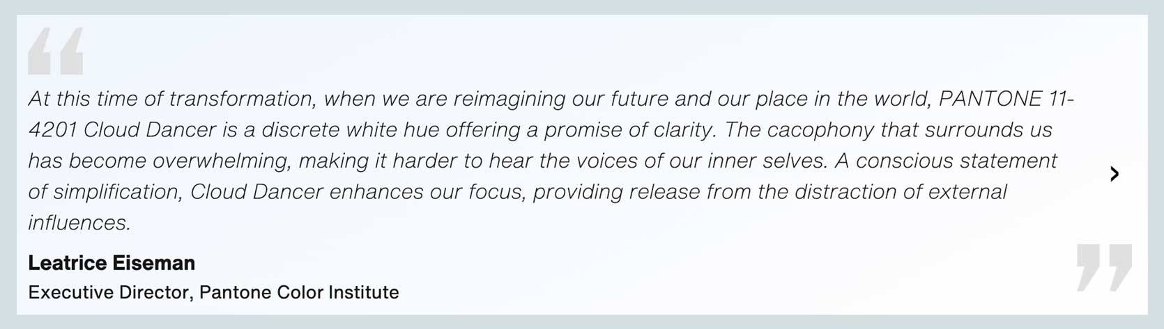
In a year marked by upheaval and change, Pantone made an unexpected choice for the color of the year: white. Specifically, they chose PANTONE 11-4201 Cloud Dancer, describing it as a symbol of calmness and reflection in a society seeking solace.
The choice of white sparked a wave of reactions and rejections on social media, with many expressing confusion and disappointment. Some even criticized the choice as tone-deaf or supporting certain agendas.
The Reactions & Rejections
Various strong opinions were shared online about Pantone’s selection, reflecting the diversity of reactions to Cloud Dancer.
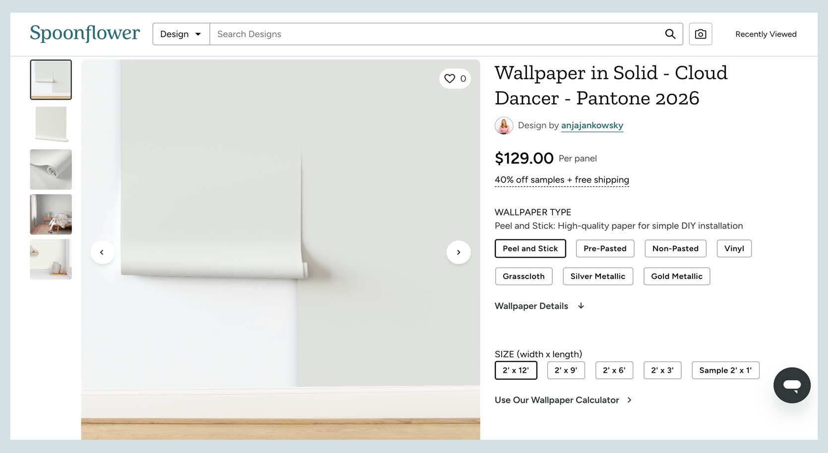
Initially, the choice of white left many feeling uninspired, with some viewing it as a missed opportunity for a more vibrant or meaningful color. The product collaborations tied to Cloud Dancer, including white Play-Doh and furniture, were seen as ironic and underwhelming.
Is Pantone Just Rage Baiting Us?
Some have speculated whether Pantone’s choice of white was intended to provoke strong reactions and reignite interest in the Color of the Year tradition. The decision to opt for a neutral and calming color in a turbulent time raised questions about the brand’s motives.
Despite the initial backlash, some have suggested that Pantone’s selection of white may symbolize a clean slate or a retreat from the chaos of the world. While not as visually exciting as previous choices, Cloud Dancer could serve as a quiet refuge in a noisy world.
What Does Cloud Dancer Say For Interiors In 2026 & Beyond?
Looking ahead, the choice of Cloud Dancer raises questions about interior design trends and color palettes for the coming years. While some find the color uninspiring, others see it as a potential shift towards cleaner and brighter interiors.
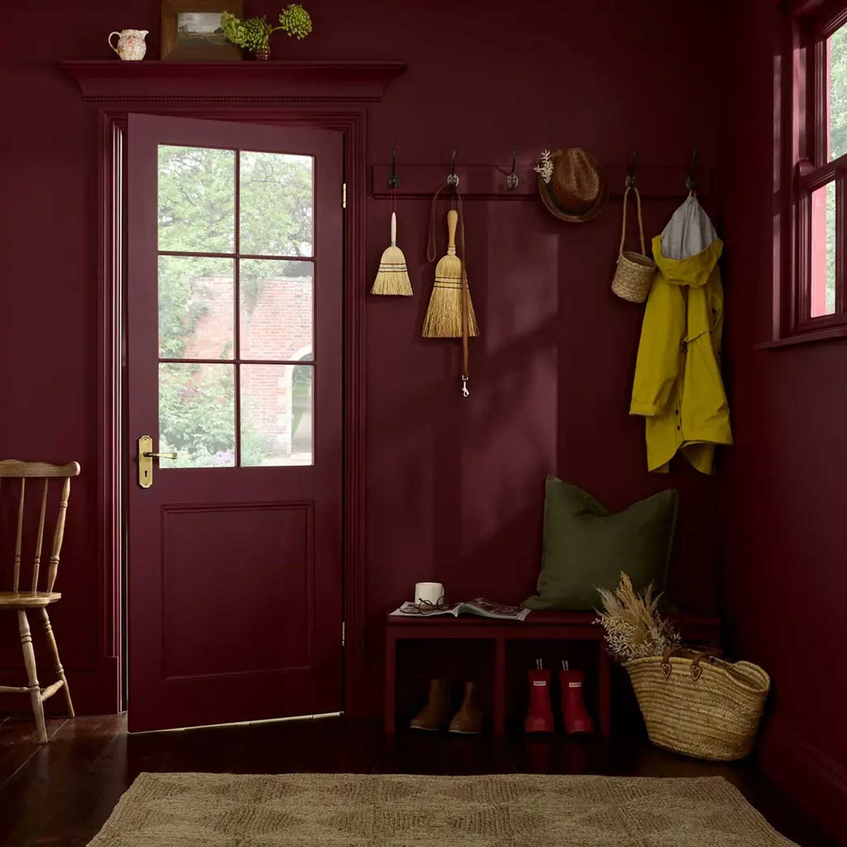
Amidst the controversy surrounding Pantone’s Color of the Year, other companies have announced their own selections, offering vibrant and expressive hues that inspire creativity and individuality.
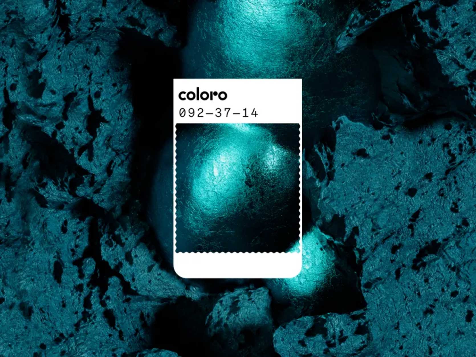
Colors like Transformative Teal, Luminous Blue, and Divine Damson offer a stark contrast to Cloud Dancer, embodying richness, drama, and timelessness. These colors evoke a sense of boldness and authenticity that resonates with a desire for self-expression.
While Pantone’s choice of white may have sparked debate, the diverse selection of colors from other brands offers a refreshing and inspiring outlook for design trends in the years to come. Whether opting for soothing neutrals or vibrant jewel tones, there is a color palette for every taste and style.
Despite the controversy surrounding Pantone’s Color of the Year, the conversation around color trends and design remains vibrant and evolving. As we look towards the future, let’s embrace the diversity and creativity that colors bring to our lives.
*Opening Image Credits: Photo courtesy of Pantone